Vector Charts
I’ve been working in the marine software space for years, and adding nautical charts to applications is a frequent requirement.
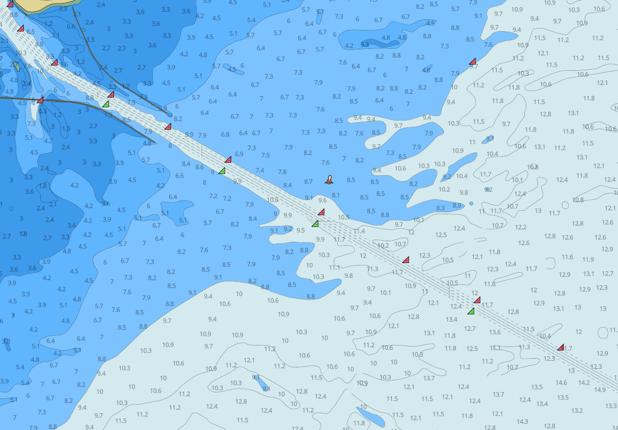
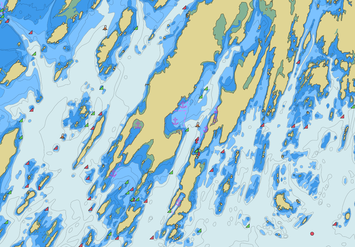
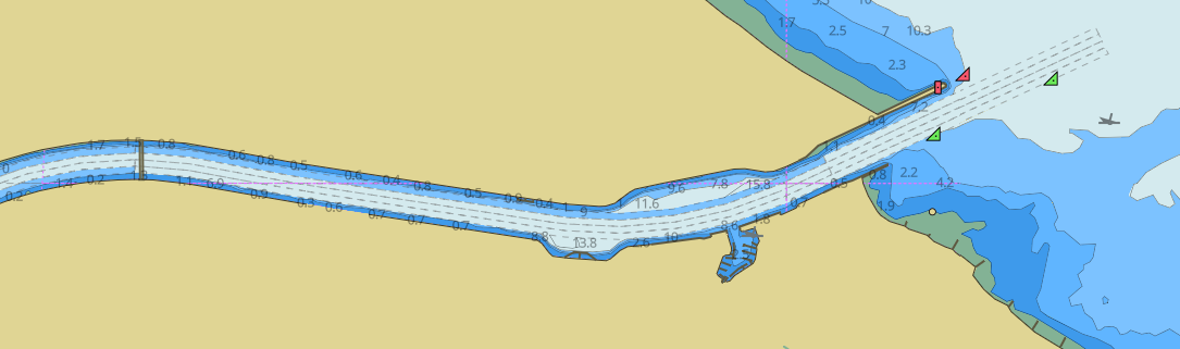
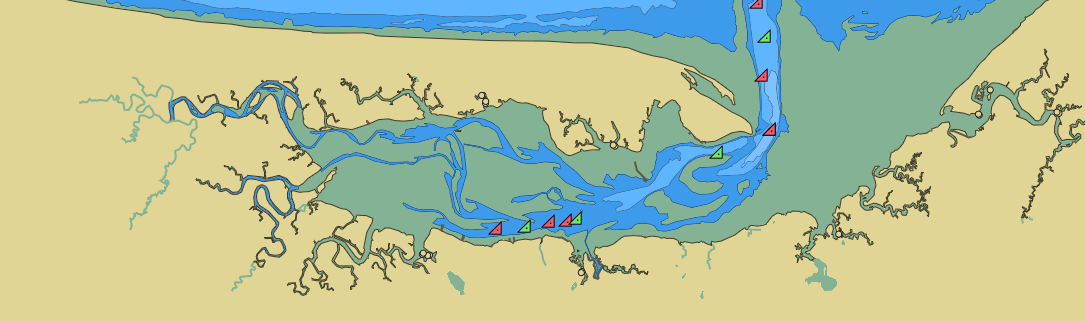
“Nautical Charts” are maritime-specific maps that show, in great detail, the structure of the ocean environment, above and below water. Among other info, they show bathymetry contours, which help avoid boats running aground. They’re relied on by both professional and recreational mariners to navigate safely and are a mature technology that’s been around for many years.
There are many SDKs (“kernels”) to render nautical charts for native applications, but the existing options aren’t great for web apps for a few reasons.
First, chart kernels are generally too expensive for small web apps, due to the fact that they’re designed for expensive safety-critical user interfaces used for navigation on commercial vessels and are priced accordingly. This prevents the use of charts for non-navigational, informational purposes.
Second, chart kernels generally render chart data as raster images, intended to render live as the user moves around, which makes them a bad fit for web maps which are often tiled. tiled maps use a gridded coordinate system setup as a quadtree, where individual images cover a fixed area splits when the user zooms in too far.
Trying to adapt a system intended for live-scrolling rendering into one which uses tiled images causes blurry or pixelated text and a cluttered view.
The bottom line is that it’s way too hard to use nautical charts on the web.
To solve this, I built Vector Charts - An API to add nautical charts to any web app.
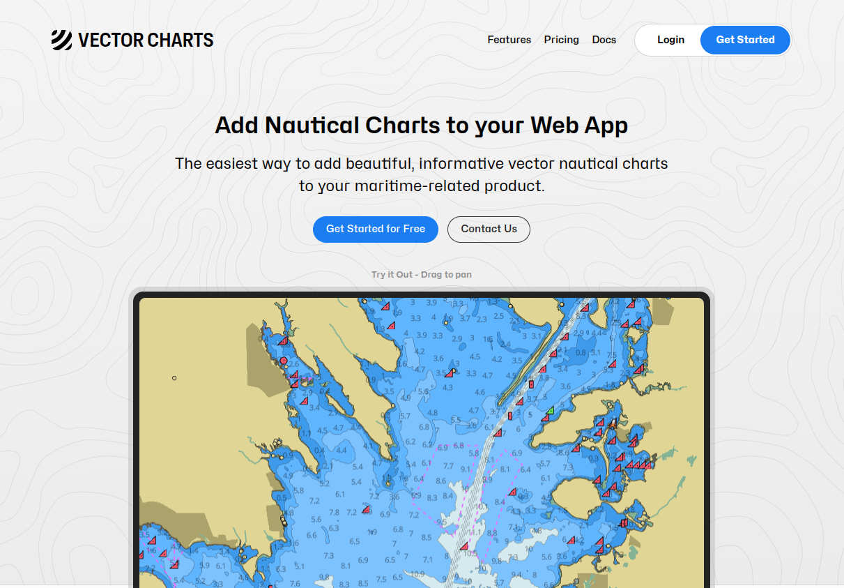
Vector Charts is live now on https://vectorcharts.com/, where you can use it now.
And https://app.vectorcharts.com/ is a free nautical chart app, powered by the Vector Charts API.
Vector Charts focuses on non-safety-critical web experiences that might benefit from nautical charts, which is a growing segment of the market.
A few examples: A live tracking map for a sailboat race, a watersports logging app, or an unmanned surface vessel C2 software. Anywhere that you’re building a web app for a marine setting, nautical charts are likely a better background layer than satellite.
My priorities: 1) Accuracy: always provide accurate information based on the latest chart files. 2) Ease of use: It should be as easy as any other map tile API to add nautical charts to your app. 3) Aesthetics: Leverage the modern rendering of vector tiles, present a visually appealing map which communicates essential information without looking cluttered
On a technical level, this is a perfect use-case for PostGIS, which is the core of the product.
Charts are hand-authored by government hydrography offices and encoded into a format called “S-57”. These files contain spatial data for a small area, and different charts cover different zoom levels. This presents a few problems for web apps: Charts of different intended zoom levels cover each others data, the full chart dataset is too large to stream, and charts aren’t divided into xyz tiles cleanly.
To solve this, I run a bespoke pipeline which processes all nautical chart data into an internal format using PostGIS. From there, I merge all chart data together, overlaying higher accuracy charts over the lower accuracy charts. The pipeline performs a lot of data validation & reconciliation to remove bad data, then simplifies & renders to vector tiles.
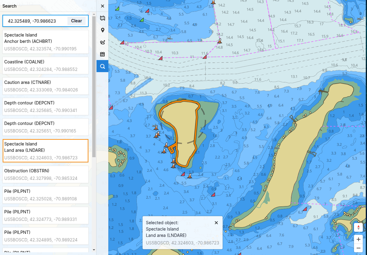
I’m also able to implement spatial search and other features using PostGIS easily. (Below: Realtime object picking under the user’s cursor)
The coolest thing about this project, in my opinion, is that it was a rare opportunity to understand an esoteric format deeply instead of starting from an existing dataset such as OSM. I’m really proud of the result: A beautiful, smooth map that combines the best of modern rendering with the timeless reliability of an old format.
And it just looks awesome.